x
PROJECT TYPE:
Residential, Single-Family, RenovatIon / Addition
CATEGORY:
Architecture, Interior Architecture
LOCATION:
San Diego, California
SIZE:
275 s.m. (3,000 s.f.)
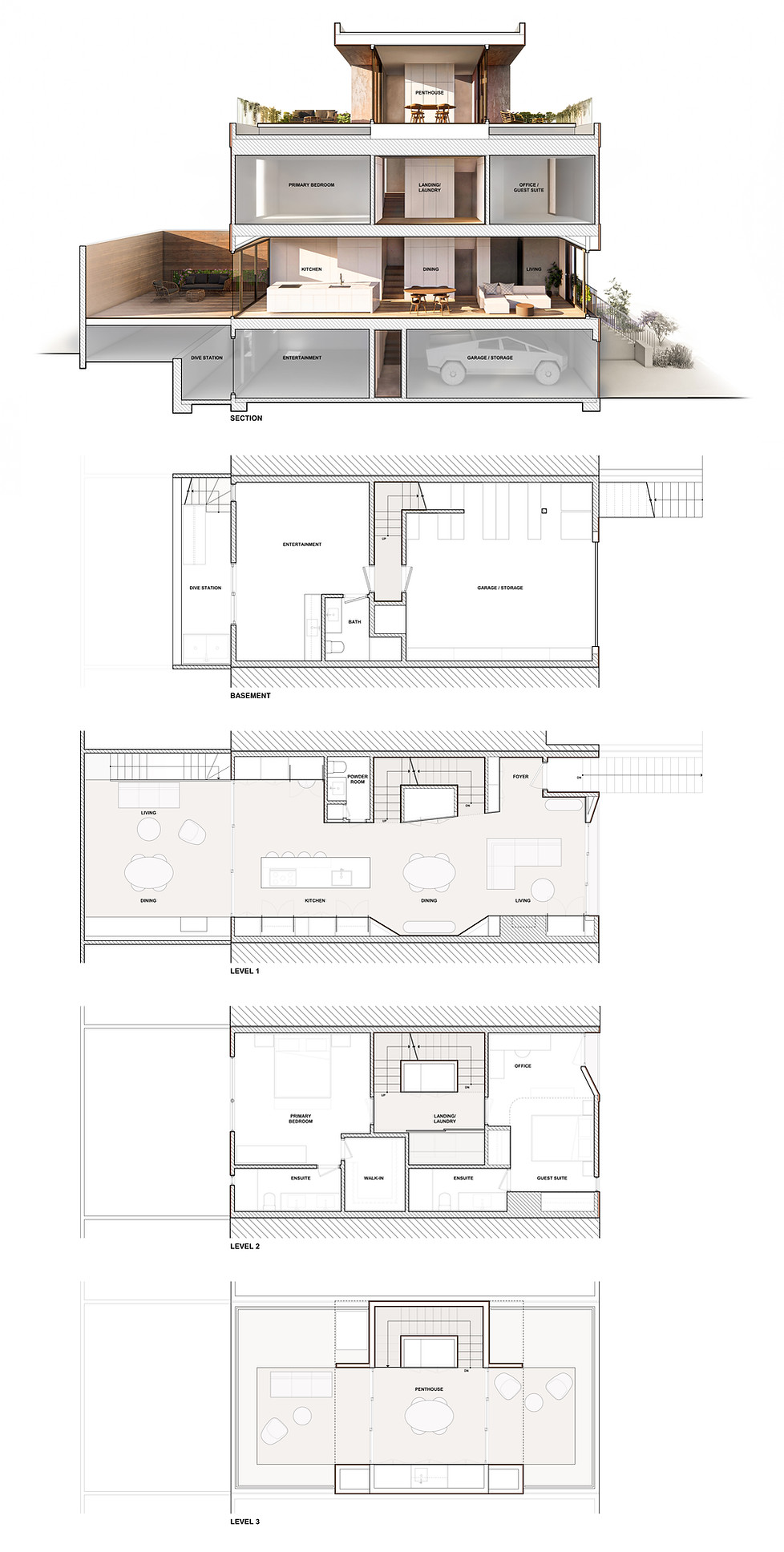
Located towards the more austere end of a series of kitsch 90’s rowhouses flanking San Diego’s Balboa Park, this Bankers Hill renovation and addition offers something a little more robust. A set of measured interventions proposed to work with and draw out the largely obscured qualities of the existing home ultimately results in a complete reinvention of the interior and exterior architecture. Further, a neatly packaged rooftop addition literary and figuratively elevates the design along with the 270-degree views of the sunrise over Balboa Park, downtown, and sunset over San Diego Bay.
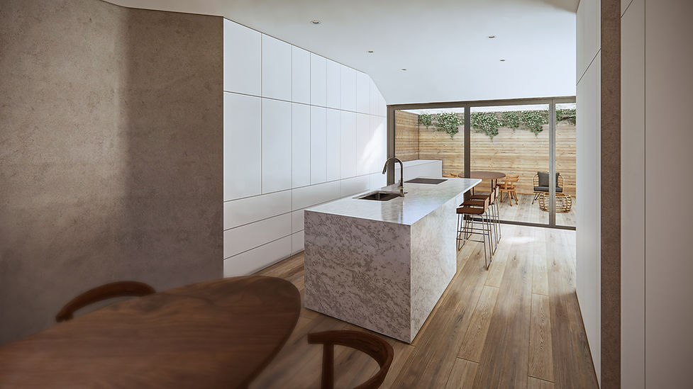
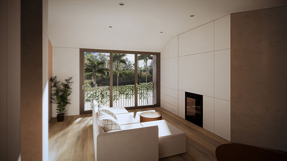
Previously dizzying, a simplified and fully open kitchen and main floor connect outdoor living spaces on reconfigured rear deck through to the front façade, where the formal living room rests perched a story above a busy street overlooking the park. In the middle of the main floor, the dining room sits centered on a visually clarified yet subtle feature stair that provides a spatial definition between living, dining, and kitchen. Supplementing the more practical qualities of improved cross ventilation and daylight penetration, angled walls opposite the stair hug and anchor the dining room. A similar ceiling gesture softens the thresholds at the exterior and provides a more significant visual connection between the inside and outside. As a more vertical home, the second floor is conceived as a landing and continuation of the stairs, where private spaces are made quickly accessible before taking occupants up to new rooftop spaces.
Bookended by the other neatly detailed townhouses in the row and slightly more confused than it is banal, the existing home has a limited presence for a prominent high-value address. Marrying the restraint of the context with purposeful and playful architectural moves provide a more vigorous façade with continuity between the exterior language and interior use. While balancing the horizontal and vertical qualities of the existing streetscape, the design embraces its vertical proportions by taking on a singular unified form. At the same time, horizontal gestures reference its stacked nature and the adjacent homes. The building form is delicately eroded along these gestures, communicating a hierarchy of private and semi-public spaces while creating solar and rain protection for doors and operable windows. This design approach unifies the lower floors with a set-back penthouse that culminates in even more dramatic overhangs. Planted guardrails take this further, softening the architectural language while maintaining privacy without sacrificing daylight and views.


